
Basic Oil Palette
After unpacking a box of my first set of professional artist quality oil paints the other day (a thrilling moment indeed!), I thought it might be useful to put together a quick post featuring a basic oil palette.
Keep in mind that this is just my personal palette. Paint palettes can vary greatly from artist to artist, and a palette that works well for portraits might look different than one used primarily for landscapes.
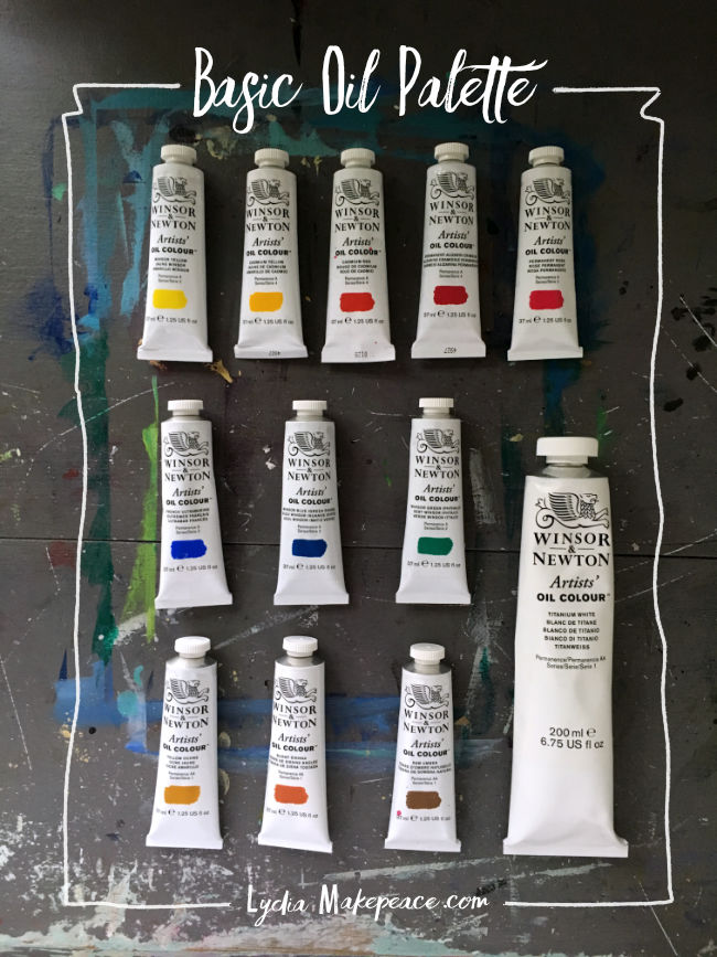
I selected the following palette to be used for a variety of subject matter and plan to edit and add to it when funds allow. I’ve included the Winsor and Newton color names along with the pigment codes in parenthesis so you can purchase the same pigments from the brand of your choice. (Learn about pigment codes HERE)
- Winsor Yellow (PY74)
- Cadmium Yellow (PY35)
- Cadmium Red (PR108)
- Permanent Alizarin Crimson (PR177)
- Permanent Rose (PV19)
- French Ultramarine (PB29)
- Winsor Blue (PB15)
- Winsor Green Phthalo (PG7)
- Yellow Ochre (PY43)
- Burnt Sienna (PR101)
- Raw Umber (PBr7)
- Titanium White (PW6, PW4)
Whether it’s watercolor, acrylic or oil my paint palette tends to follow a pretty basic formula - warm and cool versions of each of the primary colors (yellow, red, blue), a green or two, earth colors, and depending on the medium, white.
You might have noticed there’s no black on that list, and for good reason - I’m allergic. That’s how my mom explains it anyway. Apparently I was born a color lover and even as a child spurned my black crayon.
Yes, I adore color but practically speaking I often find black paint too stark and use it so rarely that I prefer to mix my own. You’ll find the most deliciously rich black can be mixed from a cool red such as Permanent Alizarin Crimson and a cool green like Phthalo.
This is proving to be a good foundational palette and I look forward to adding additional colors as well as experimenting with various brands. I just need to hunt down some funds…
More advice on selecting a basic paint palette HERE