
New Colors for the New Year
I’m indebted to Liz Steel for this ingenious idea of sketching my current palette on the first page of a new sketchbook. Not only is it a useful record of palette changes over time, but it helps get me past the perfectness of a new sketchbook. That unmarred perfectness can keep me from diving in for fear of ruining its pristine white pages.
A sketchbook is meant for the messiness of exploration!
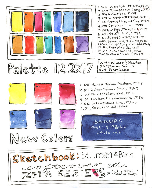
PALETTE 12.27.17
// WN = Winsor and Newton, DS = Daniel Smith, SCH = Schmincke //
Each color name is listed with its pigment code.
- WN Winsor Yellow PY154
- SCH Transparent Orange PO71
- DS Quinacridone Rose PV19
- WN Winsor Green (Blue Shade) PG7
- DS French Ultramarine PB29
- WN Cerulean Blue PB35
- WN Indigo PBk6, PV19, PB15
- WN Gold Ochre PY42
- DS Pyrrol Scarlet PR255
- DS Green Gold PY150, PY3, PG36
- WN Cobalt Turquoise Light PG50
- DS Phthalo Blue PB15
- WN Burnt Sienna PR101
- WN Winsor Violet PV23
New colors to try:
- DS Hansa Yellow Medium PY97
- DS Quinacridone Coral PR209
- DS Quinacridone Red PV19
- DS Cerulean Blue Chromium PB36
- DS Indanthrone Blue PB60
- DS Cobalt Violet PV49
I am again indebted to Liz Steel and also Jane Blundell for introducing me to some of these new colors - Hansa Yellow Medium, Cerulean Blue Chromium, and Indanthrone Blue. I’ve discovered that because my sketching palette and studio palette are used for different subjects they require different color ranges.
For everyday sketching I need a palette that requires less mixing and has an extended selection of blues and greens. I currently use my studio palette for custom portraits (everything from pets to wedding bouquets) and I’ve had difficulty achieving certain violets and reds.
Permanent Alizarin Crimson was once a palette staple for me, but I find it too flat now and have been searching for a lively but cooler shade of red than the fuchsia hue of PV19. Red roses in particular have been especially challenging to achieve without them shifting to a pinker hue. I’m hoping that Daniel Smith’s Quinacridone Red is THE red I’ve been hungering for. (I’ll let you know how it goes...)
Another difficult hue to achieve has been bright saturated violets. Daniel Smith’s Cobalt Violet happens to be the exact color I’ve been looking for whilst also being a single pigment color. Single pigment paints make it easier to achieve vibrant and lively mixes.
// Strive to minimize color mixing to 2-3 pigments if you find your paintings coming out flat and muddy looking //
In addition to new colors, I’m also trying out a new sketchbook. So far I’m really loving the larger 8” x 10” format of this Stillman & Birn Zeta Softcover sketchbook. Stay tuned for an updated look at my palette and a sketchbook review.