
Palette Update - 1.11.18
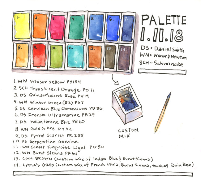
My palette as of 1.11.18
Note: WN = Winsor and Newton, DS = Daniel Smith, SCH = Schmincke
I’ve included the pigment codes with each color name. Learn about pigment codes HERE
- WN Winsor Yellow PY154
- SCH Transparent Orange PO71
- DS Quinacridone Rose PV19
- WN Winsor Green (Blue Shade) PG7
- DS Cerulean Blue Chromium PB36
- DS French Ultramarine PB29
- DS Indanthrone Blue PB60
- WN Gold Ochre PY42
- DS Pyrrol Scarlet PR255
- DS Serpentine Genuine
- WN Cobalt Turquoise Light PG50
- WN Burnt Sienna PR101
- Cool Brown (custom mix of Indanthrone Blue and Burnt Sienna)
- Lydia’s Grey (custom mix of French Ultramarine, Burnt Sienna, touch of Quinacridone Rose)
Until recently, I shunned so called convenience mixtures (paints that are premixed combinations of multiple pigments) because they made me feel lazy and seemed unnecessary. I have since discovered that convenience mixtures can be INCREDIBLY useful for travel sketching when time is of the essence. In general, the less mixing I do on the palette, the fresher my final sketches are. When I boldly put paint directly to paper and allow the colors to mingle and do their thing, without futzing about, I overwork far fewer paintings.
You can make your own premixed colors by squirting small amounts of paint directly from the tube into empty paint pans using a toothpick to mix.