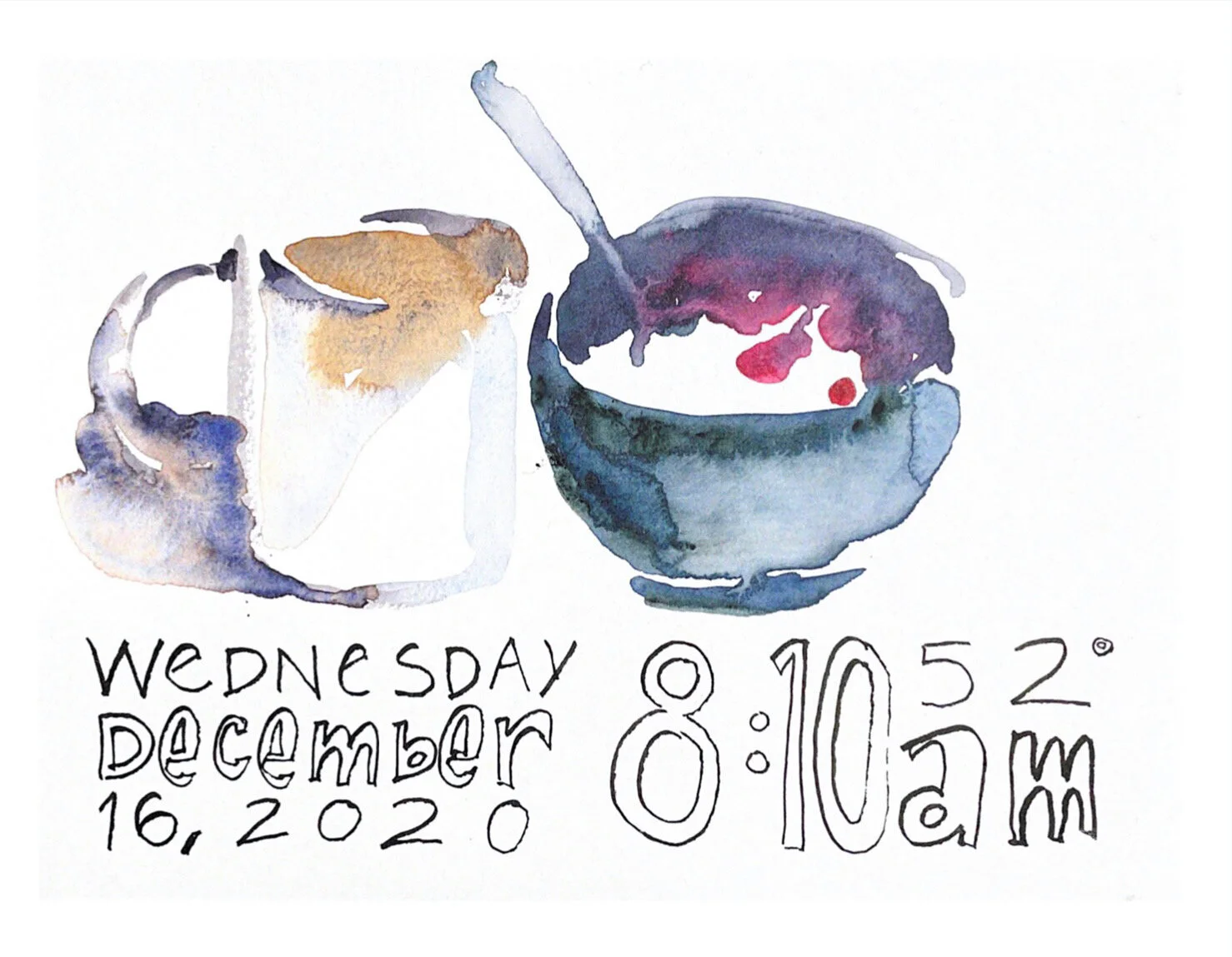
Art Journal: Orange and Blue
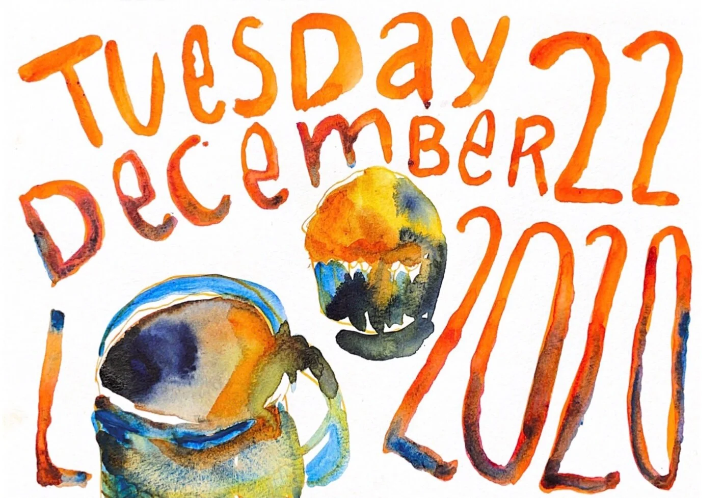
Bold impressionistic watercolor illustration of a coffee cup and blueberry muffin in vibrant shades of orange and blue that mix loosely on the page. Hand painted text included in post below.
Tuesday
December 22
2020
I challenged myself to put paint directly to the paper without premixing the colors. It makes for a looser bolder painting.
Watercolor paint can lighten as it dries and it’s easy to end up with a washed out painting because the paint looks intimidatingly dark when wet.
Over-mixing on a palette can lead to muddy colors. Allowing colors to blend together on the page can help keep them vibrant.
One of the magical characteristics of watercolor is the way water mingles paint pigments! Applying various colors to wet paper encourages this spontaneous unpredictable play of pigment.
I LOVE the balancing act watercolor painting requires. There’s a tension between controlling the amount and placement of water/paint and learning when to let them do their thing. It’s a good life lesson too. 😂
If you found these insights into watercolor helpful you might also enjoy these additional watercolor painting tips: