Daniel Smith Watercolor 238 Dot Color Chart
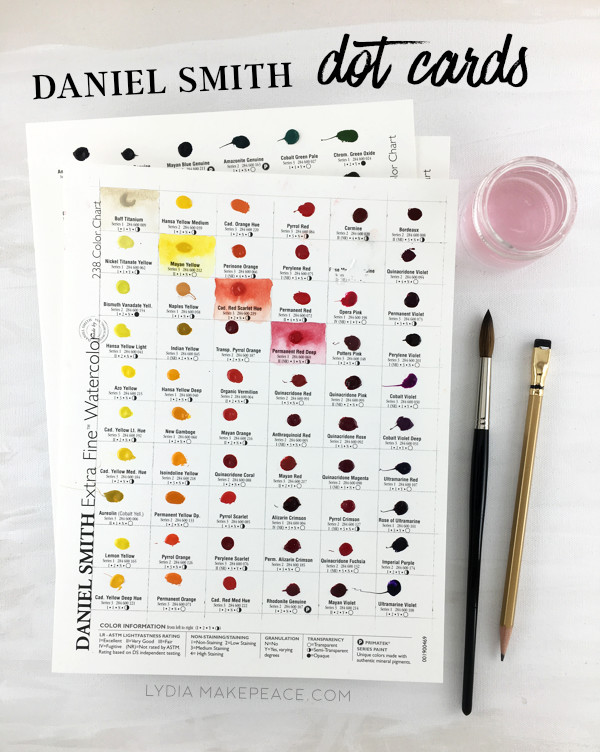
If you’re a color fiend like me, Daniel Smith dot cards are a great way to sample the entire Daniel Smith watercolor line! In this post I review dot cards and show you how to get the most out of your sampler.
Before painting the color swatches I lightly penciled a grid of boxes around each dot.
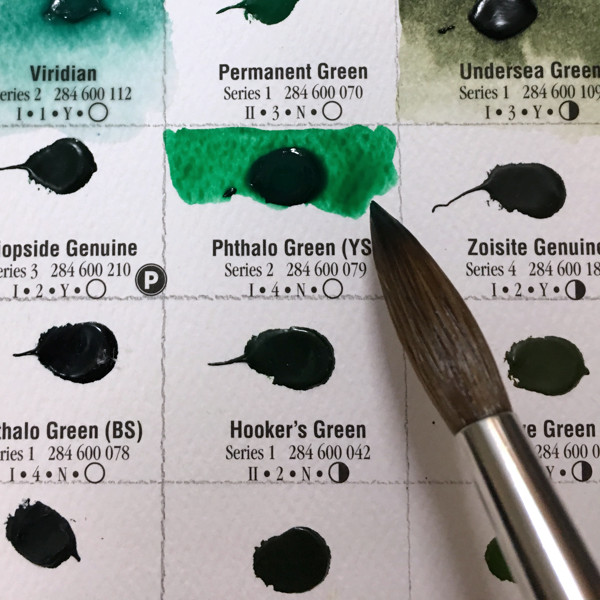
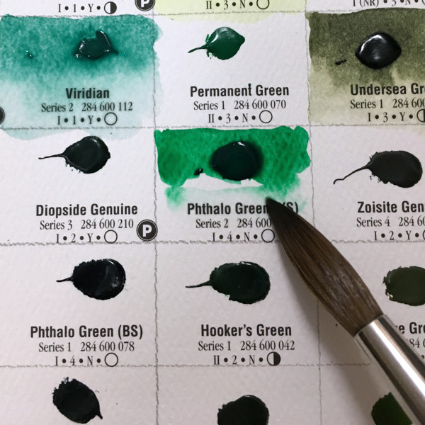

To achieve variation in value, wet the dot and paint the top half of the box at full strength. With a clean brush wet the bottom half of the box with water and carefully connect it to the top half of color. The full strength color will then bleed into the bottom half creating a full range of color from dark to light.
Note the limited value range of the yellow hues. Darker colors like reds and purples are capable of a greater range of darks and lights. (You’ll also notice an empty box because Daniel Smith discontinued that color. )
As I tested each color I took note of which colors were difficult to rewet (Cobalt Green Pale - top row, second from right) or had a low tinting strength (Lapis Lazuli Genuine - second row, second from left). If you often use pans of paint like I do for urban sketching being able to quickly and easily rewet your paint is an important consideration. Tinting strength affects how much paint you need to use to achieve the darkest darks. You’ll find yourself using a lot more paint when a color has a low tinting strength, something to think about if you’re on a tight budget.
I noticed some major color shifts in the scarlets and maroons on this card. When wet they were quite bold but they became more muted and subdued as they dried. By contrast the Quinacridone Sienna (7th row 3rd from left) stayed quite vibrant even when dry. Watercolors due tend to lighten as they dry but you’ll notice some colors shift more than others.
I was disappointed with this last card featuring Daniel Smith’s iridescent and duochrome colors. Many of the dots were difficult or impossible to rewet. Additionally it would have been helpful if the card was two toned so that the interference properties of the duochromes could be observed. I did enjoy the possibilities of some of the iridescent golds and coppers though.
In summary:
I highly recommend the Daniel Smith dot cards and wish every major paint manufacturer offered such useful samplers. (I’m looking at you Winsor and Newton!) The dot cards are a useful reference when selecting colors for your palette as well as a valuable tool for observing each pigment's unique properties. I’m busily compiling a wish list of new colors to add to my ever expanding palette!
Treat yourself to Daniel Smith dot cards HERE